I watched a brilliant film in my French and Italian cinema class this week called Copie Conforme or Certified Copy. It follows a man and a woman through the Italian countryside and we watch as James, the celebrated author and the unnamed single mother develop a rather peculiar relationship.
What piqued my interest most, besides the heart wrenching storyline (my summary does the film no justice by the way), was James' initial lecture. James, an author, is on a book tour where he argues that there is value in the copy of a work in that it leads us to the original, therein certifying the value of the archetypal piece. He says that we associate the word "original" with the authentic, the genuine, the reliable in such a way that it possesses tangible intrinsic value, and that really what matters is what you believe about the piece. If you believe it's an original, that's what counts. Say the original piece was completely destroyed and the copy was all we knew of it. Would that work of art be any less valuable?
I was taken by the film (spoiler alert, kind of). Though our two protagonists began as strangers, they spent the second half of the film working out their relationship as an old unhappily married couple. I almost walked out because their heartbreaking portrayal of two people who just can't seem to make it work, cut me. When the movie ended I was left wondering whether they really were strangers or if they truly were that unhappily married. Now I ask myself if it matters.
Thanks to Google and a lovely blogger, I know that this is
what I can expect to see.
Prints of original masterpieces are marked up from the amount of money it takes to produce it. We don't typically mistake prints as originals and we are usually only moved to the point that it points us to the original.
So how much are my reproductions worth? Few outside the art community have heard of Anton Mengs, what is the value of my painting to them? What is it worth to those who can't make it to Vienna to see the original? Am I arrogant enough to propose that seeing my painting could elicit the same power as seeing the original in person?
I hadn't heard of this painting before I began working on it, but I have learned the most from reproducing this painting than any other work of art I've undertaken. I still know very little about its history, and I assume that the painting hanging in the Kunsthistorisches is the one painted by the hand of Anton Mengs. Even if it wasn't, I know what it would mean to me to see what I'd believed to be original in person.
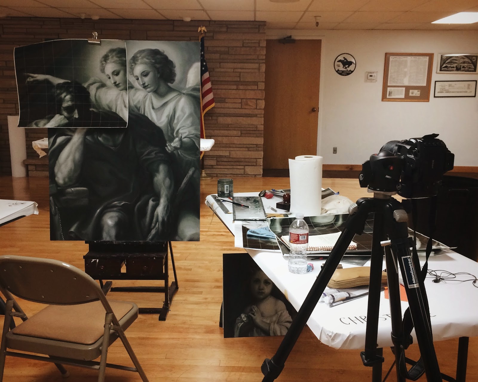
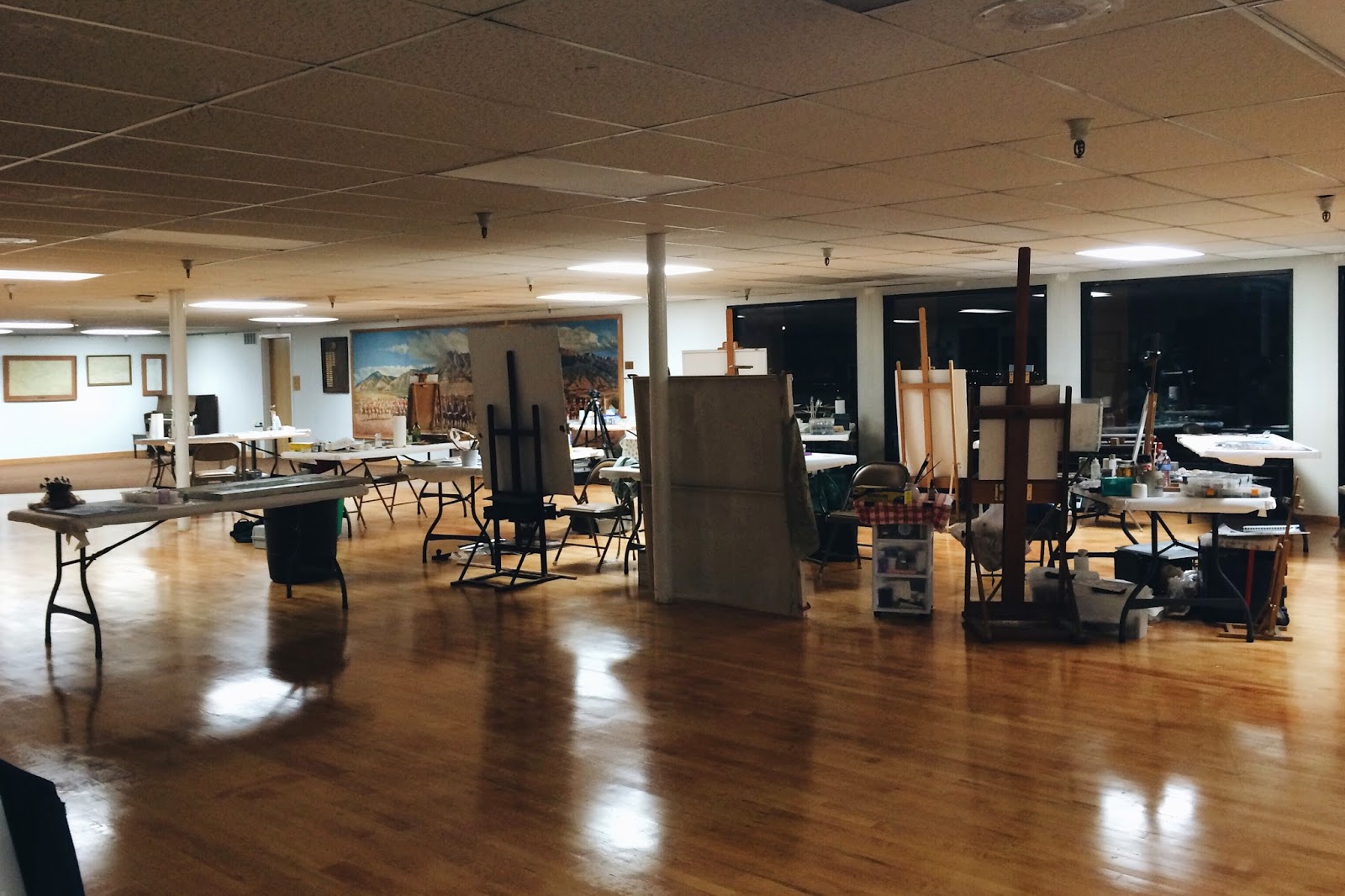
My professors were gracious enough to grant me the week off, which is good because we painted from 8:30 in the morning to 9:30 at night. We were in the Sons of the Utah Pioneers building in Salt Lake City, and since I had to drive up from Provo, I couldn't really do anything besides paint, eat, and sleep. That is, of course, until Sue, a new empty nester, invited me to come stay in her beautiful home up in Park City. My driving time went from 60 minutes (traffic ugh) to 20 minutes. She was my saving grace.
Frank Covino is my teacher's teacher and from the moment he stepped into the room, I began scribbling notes. I spent a good portion of this weekend transcribing my notes in what amounted to be about 32 pages. 32 pages! Click here to access the Google Doc.
We began the week with a lecture. Frank talked to us about the history of classical academic painting. He says that if you don't know your history, you won't be aware of what will confront you. He emphasized the importance of the Golden Ratio, particularly with regards to composition.
The Golden Ratio is, as he put it, the ratio from the Grand Designer, 1 part to 1.618. It's everywhere. It's in the heartbeat, it's all over your body, it's in the spiral of a hurricane, and so on.
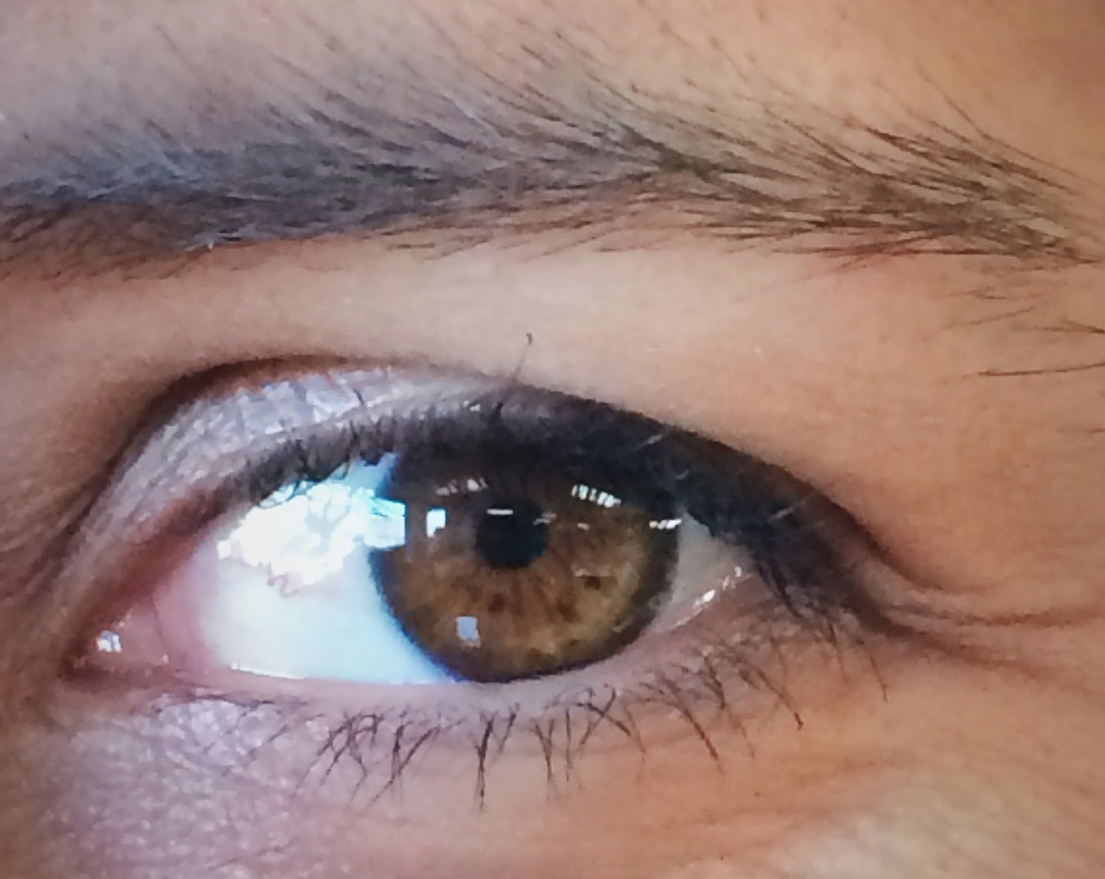
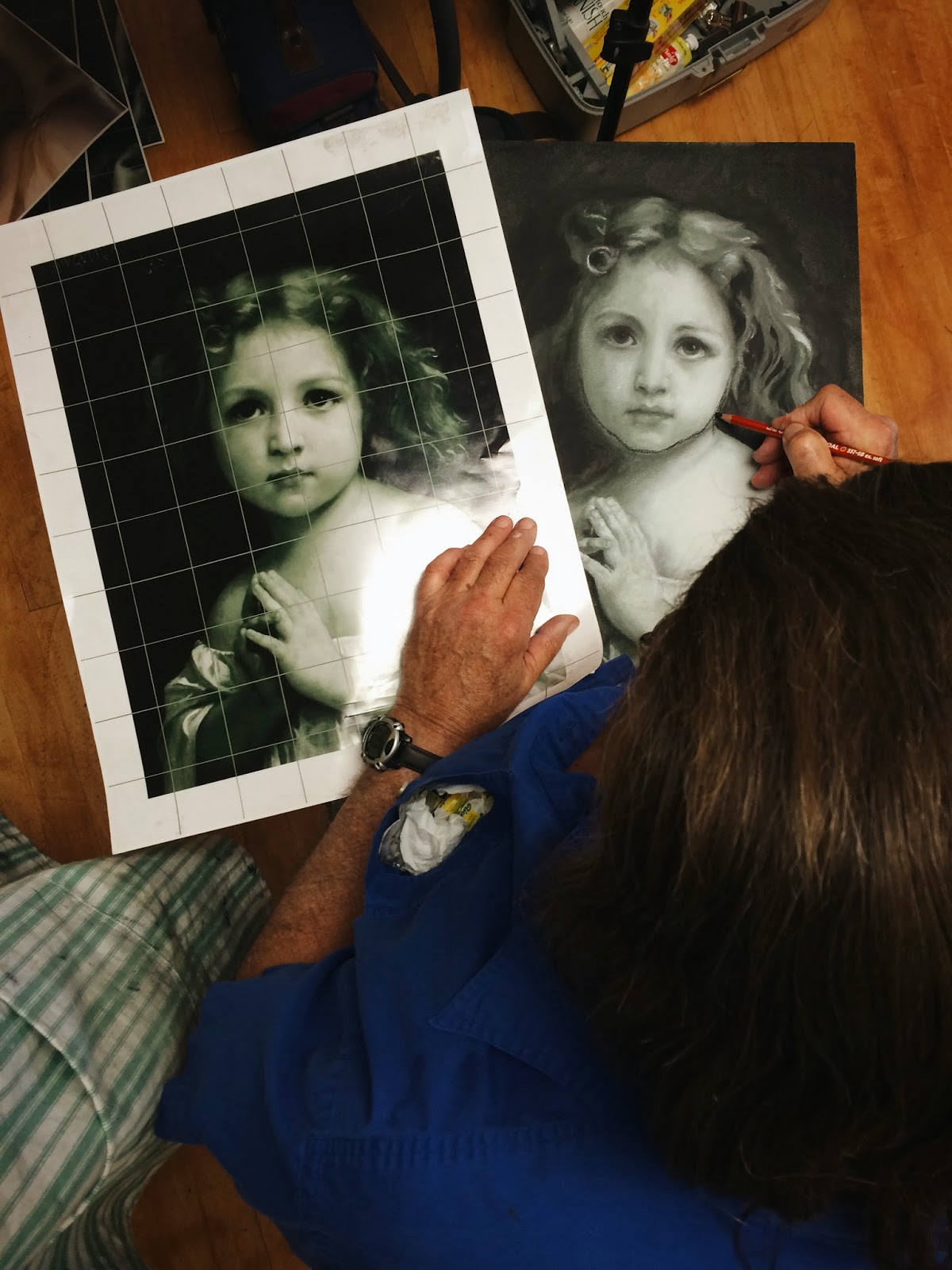
Heather and I found it in our eyes.
I have three freckles below my eye whose spacing corresponds to the Golden Ratio. Heather has three dots in her eyes whose spacing corresponds to the Golden Ratio.
Monday was a lot of lecturing. After the general lecture, we went to every station where Frank offered each of us critiques. These critiques were often him pointing out universal rules or ideas that we could apply when thinking through our own paintings. Like the fact that the lower lip protrudes out a little so it has to be rendered a value lighter than the upper lip.
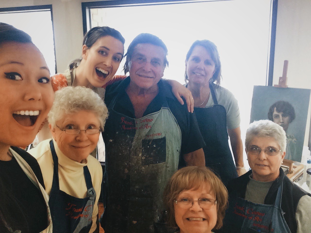
As the youngest in the group I was in charge of the selfies.
Just missing John.
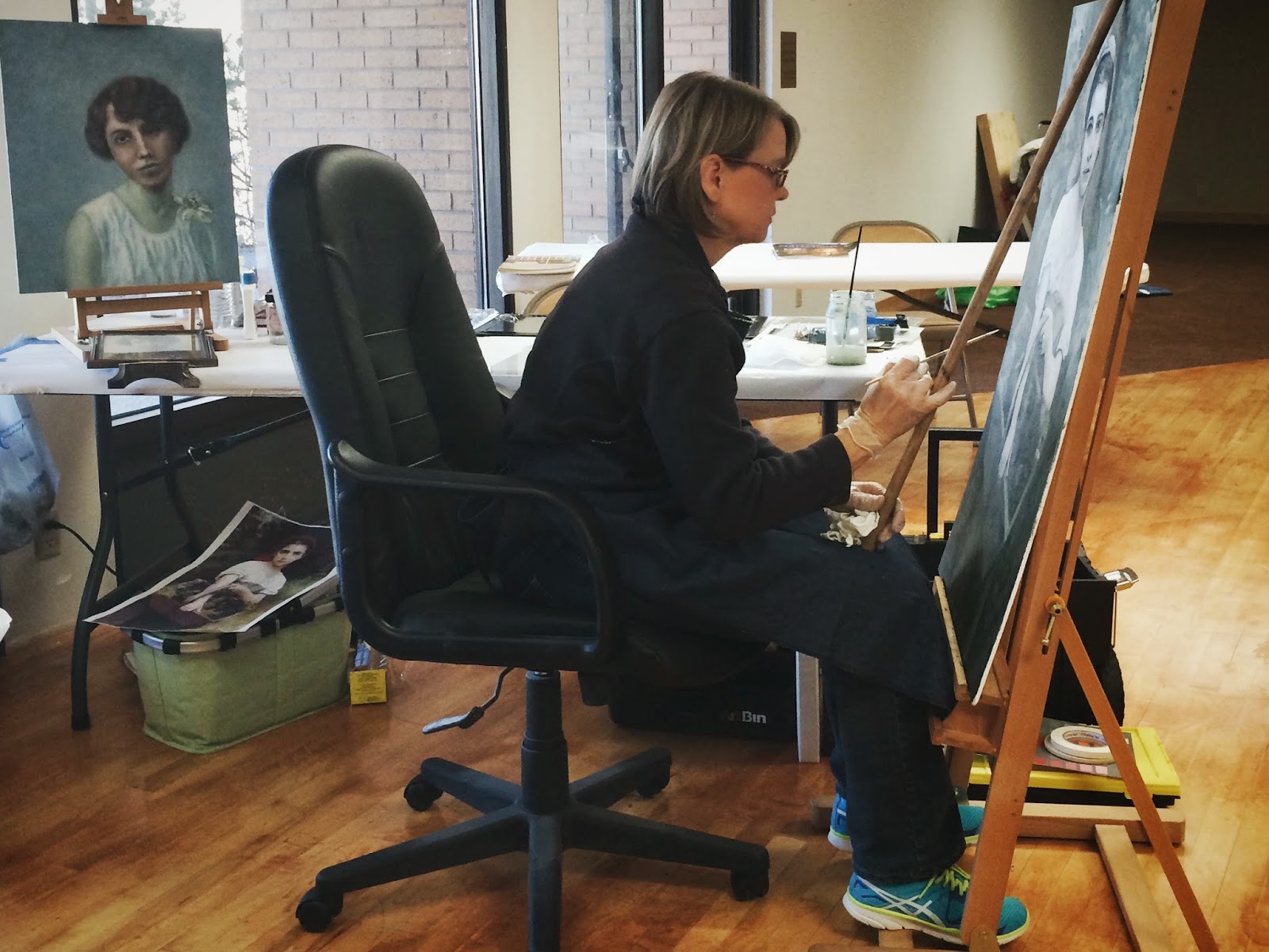
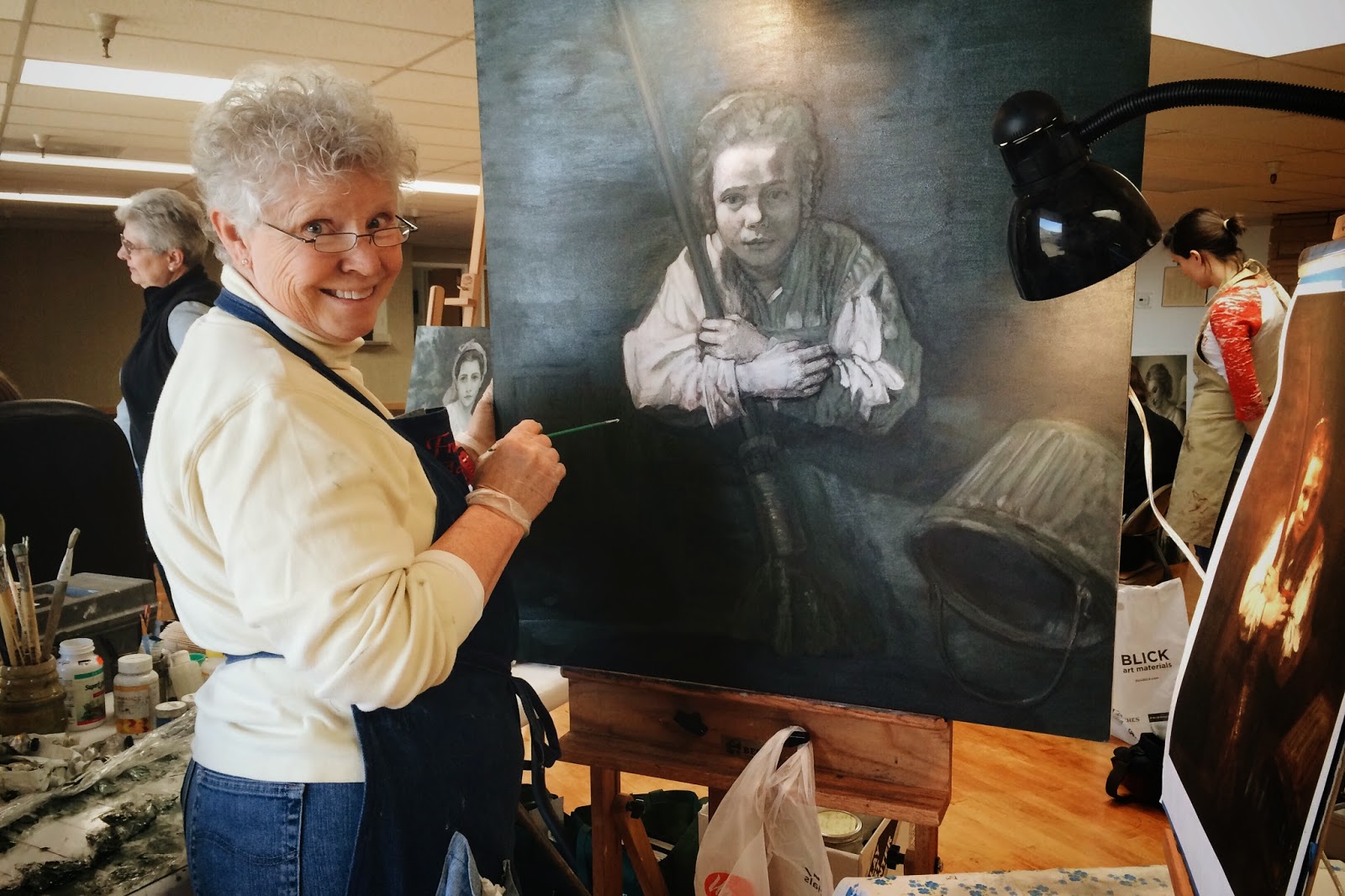
I mentioned Sue above. Here she is working on a Bouguereau.
Sue!
She makes the most incredible caprese salad with homegrown basil.
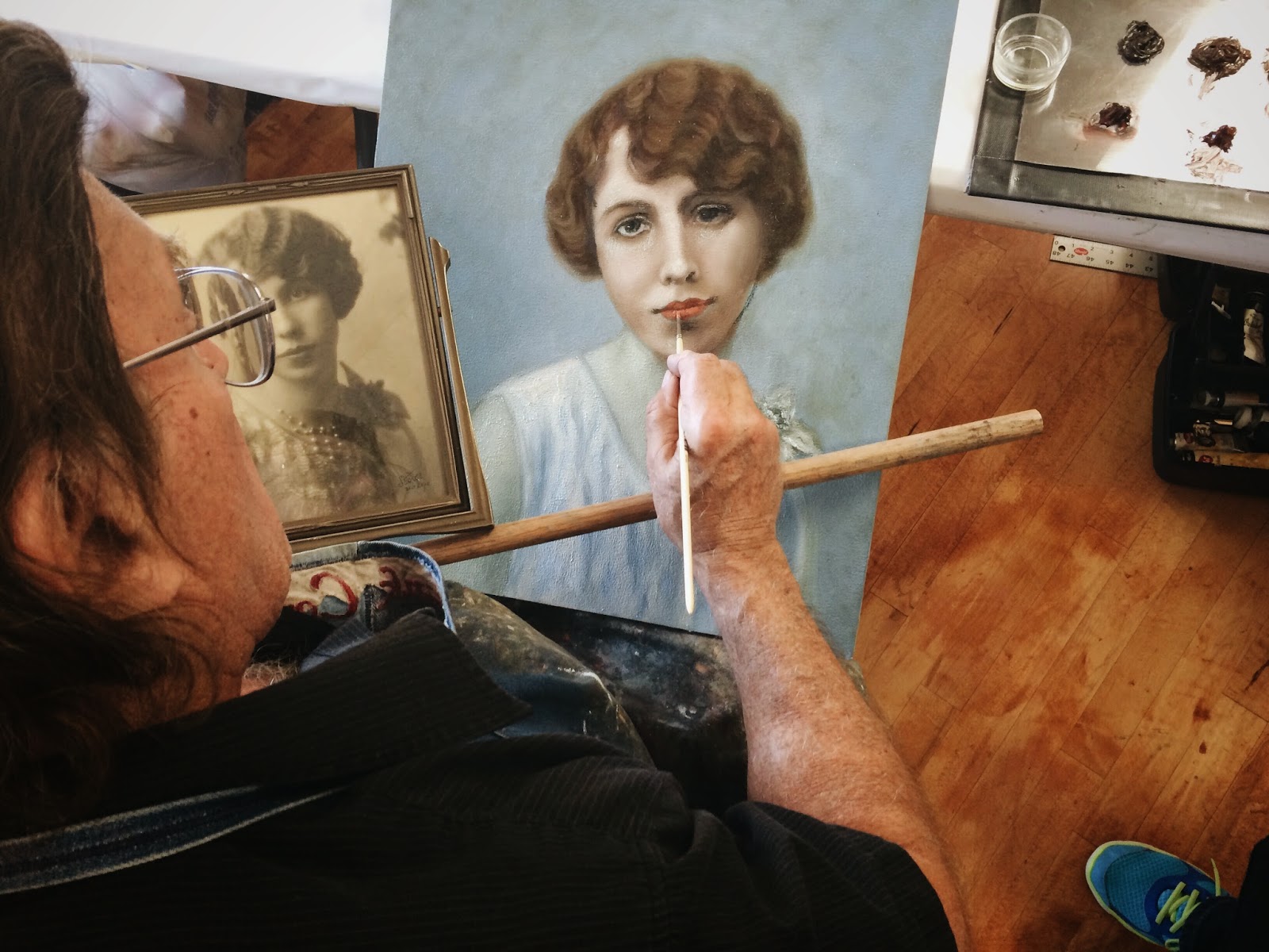
Sue also had this piece going. Here Frank's highlighting the lower lip. But she doesn't have a color reference so she's basing the flesh off of value, which is cool. She was just starting to add red or blood to her painting. She'll have to logic her way through that. Cheeks, ears, lips, creases of skin typically receive more blood. Flesh depicted without blood will look sallow.
Sue's grandmother
I was hoping to get to color this week, but Frank found enough mistakes on my piece to keep me busy. He emphasized to me that it's not enough to be able to see value, particularly on a human figure, you have to know what's causing a change in value. Know your anatomy.
It's a dark, passionate piece, and as a dark, passionate person, he was really excited about my project.
My workstation
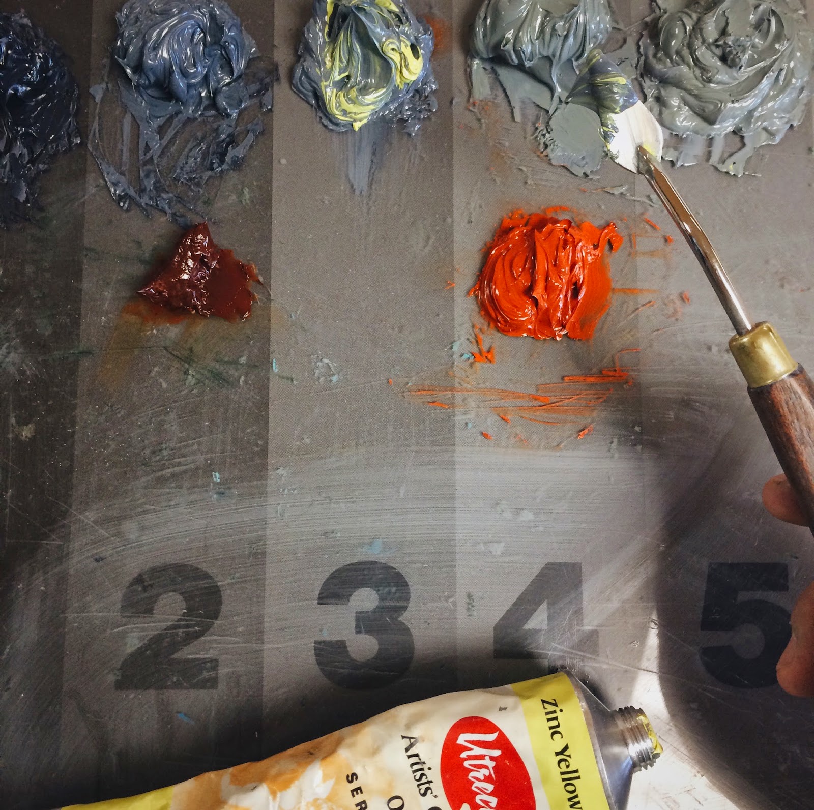
Not getting to color doesn't mean I didn't mix my color palette. We use what's called a controlled palette. Much like how musicians tune their ear to scales, we need to tune our eyes to values. The controlled palette, which is divided into nine values, with nine being the lightest, is a tool to help us reign in those values. Below is me mixing the grey of the flesh palette. I'll mix that grey row with the orange row below to make the flesh row. It's important to compare the flesh row to your reference, no two figures will have the flesh palette. Some people have grayer skin, some have hotter, more orangey skin.
Here I'm adding Zinc Yellow Hue to grey. It's like adding sun to your skin.
I used the flesh palette to clean up my angels. Apparently you're not supposed to add tinted medium to any values 6 and up which I did. The glaze got stuck in the divots and it you can see how dirty it looks.
See the dots? :(
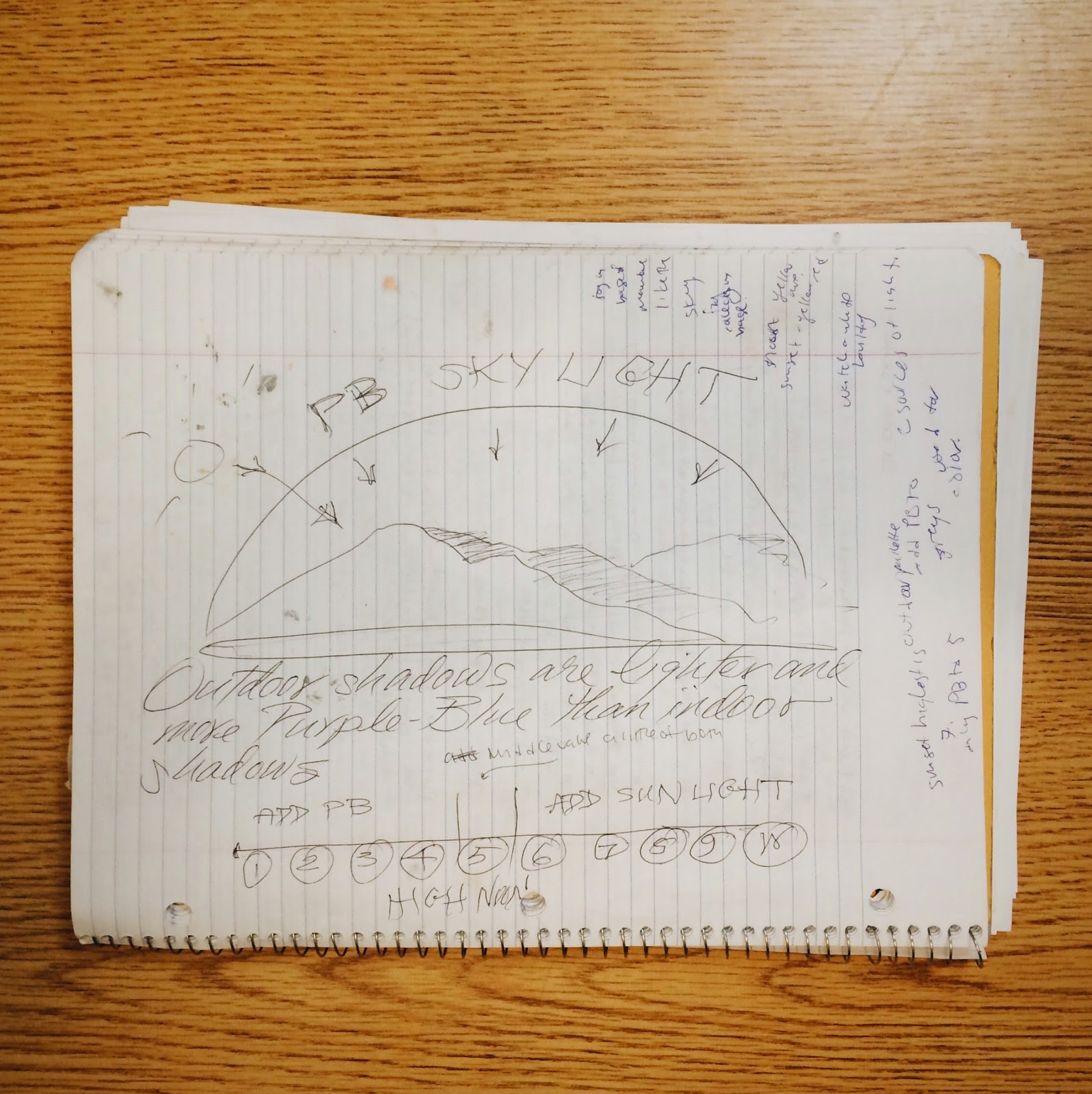
So we sanded down the glossy areas, because you never add oil paint to glossy surfaces, added clear medium to act as glue, then touched up the paint! Note that the sky is darker and more intense at the top and lighter on the bottom. This particular hue of blue made brought out the angels' flesh and made them look more ethereal. Surrounding values will always affect your figures, so be careful.
John was our only other male at the workshop, things have drastically changed since the 15th century. He was the only one doing a landscape so a lot of learning happened at his table.
Like why shadows are blueish, and that the sky gets darker and more intense the higher you go, because fog collects in the valleys, graying and lessening the intensity. Notice the figure placed right at the Golden Mean. Never place a figure or a peak or a horizon in the middle of a painting. Ever.
Most artists just draw what they see, but we're actually creating an illusion of the third dimension on a 2D board! So sometimes you have to fill in the details. Highlights bring an object closer to the viewer, so you'll often see highlights on the nose, or the tips of your lips. If a person is looking at you at a 3/4 view, you're supposed to add a little grey to the back pupil. We do this because we perceive everything through a veil of grey atmosphere. It's not as obvious when you're standing close to somebody, but if you look off in the distance, you'll notice that the mountains that are farther away are grayer, less intense. Just because we don't necessarily see the gray in the receding pupil, doesn't mean we don't include it. This helps us create an illusion of the third dimension.
Here Frank is marking up my painting. Sometimes your reference isn't going to give you all the information you need, and surely if your reference is a photograph, you are going to have to take some liberties to render your figure accurately and with good compositional values.
Here he's using a charcoal pencil and an xacto knife to mark my mistakes.
This is Jerry Lee. She's Vicky's younger sister by 13 months. They've been doing this for decades now and they drive down from Idaho to take this class. From her piece we learned how to build up value. Rembrandt took pains to build up his paint because that texture will catch ambient light. We heard multiple times a day, the lighter the value the thicker the paint. The problem is if you add too much paint, that paint will crack. So we just build it with light coats of gesso. (Light coats, because if you add too much at once, it too will crack. It dries quickly though.) Notice the form/Rembrandt lighting. It wasn't as apparent in the reference, but she knew it was there.
You can also do it with beeswax: 1/3 parts beeswax to 2/3rds paint. Frank told a story about a woman who use this method but accidentally switched the proportions. She hung the painting, a portrait of her husband, over the fireplace and over time, his face began melting off. She said she hardly noticed it at first because she would see the slight droop her husband's painted face reflected in her husbands actual face!
Jerry Lee working on a Rembrandt.
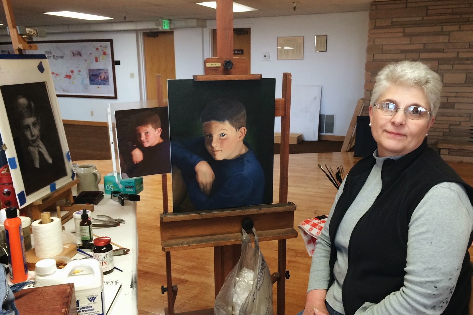
Vicky is working on portraits of her grandchildren. That kid's hair's underpainting was blue. We call it azuredaccio, and we typically use it in landscapes.
Vicky
She makes the best trail mix bars. I asked her for the recipe but it's something that she just throws together. Grandmas...
Heather is our coordinator, meaning we wouldn't have a studio or Frank for that matter without her. It's her eye that you see at the beginning of the post. She's musically trained and at one point played us some complex classical pieces on the piano from memory. She's so talented. Anyway, below is a portrait of her mother. Frank helped her shift the eyes so that it looks like she's looking at us. Doing so helps engage the viewer.
She also had him demonstrate the Venetian form of underpainting. You only have 6 hours until the paint dries so you have to work quickly.
The background story is that the Venetians wanted to attract some of Florence's patrons. At the time, Florence was the place to get a portrait. They realized they needed to do something different so they came up with this method.
I still have some work to do on my painting and I'm nearly done, but this is how it looks so far. If you look through my notes you can get a taste for what I've fixed and what I still have to fix.
On Friday before he left, he signed my journal.
He told me, "you have an extraordinary gift, but if you don't practice you will be stuck exactly where you are. I know you're in a tough spot, pursuing your studies, you need to make sure you can make money, and art isn't the most lucrative profession. But to not pursue the gift would be to throw that gift back in the Creator's face. It's hard because you didn't earn that gift, you didn't ask for it, you were given it."
It took me some time to get back in touch with reality after it was all over. I am so grateful for this week. I've got work to do.
"Great paintings -- people flock to see them, they draw crowds, they're reproduced endlessly on coffee mugs and mouse pads and anything-you-like. And, I count myself in the following, you can have a lifetime to perfectly sincere museum-going where you traipse around enjoying everything and then go out and have some lunch.
But--" crossing back to the table to sit again '--if a painting really works down in your heart and changes the way you see, and think, and feel, you don't think, 'oh, I love this picture because it's universal.' 'I love this painting because it speaks to all mankind.' That's not the reason anyone loves a piece of art.
It's a secret whisper from an alleyway. Psst, you. Hey kid. Yes you... a really great painting is fluid enough to work its way into the mind and heart through all kinds of different angles, in ways that are unique and very particular.Yours, yours. I was painted for you." The Goldfinch, by Donna Tartt
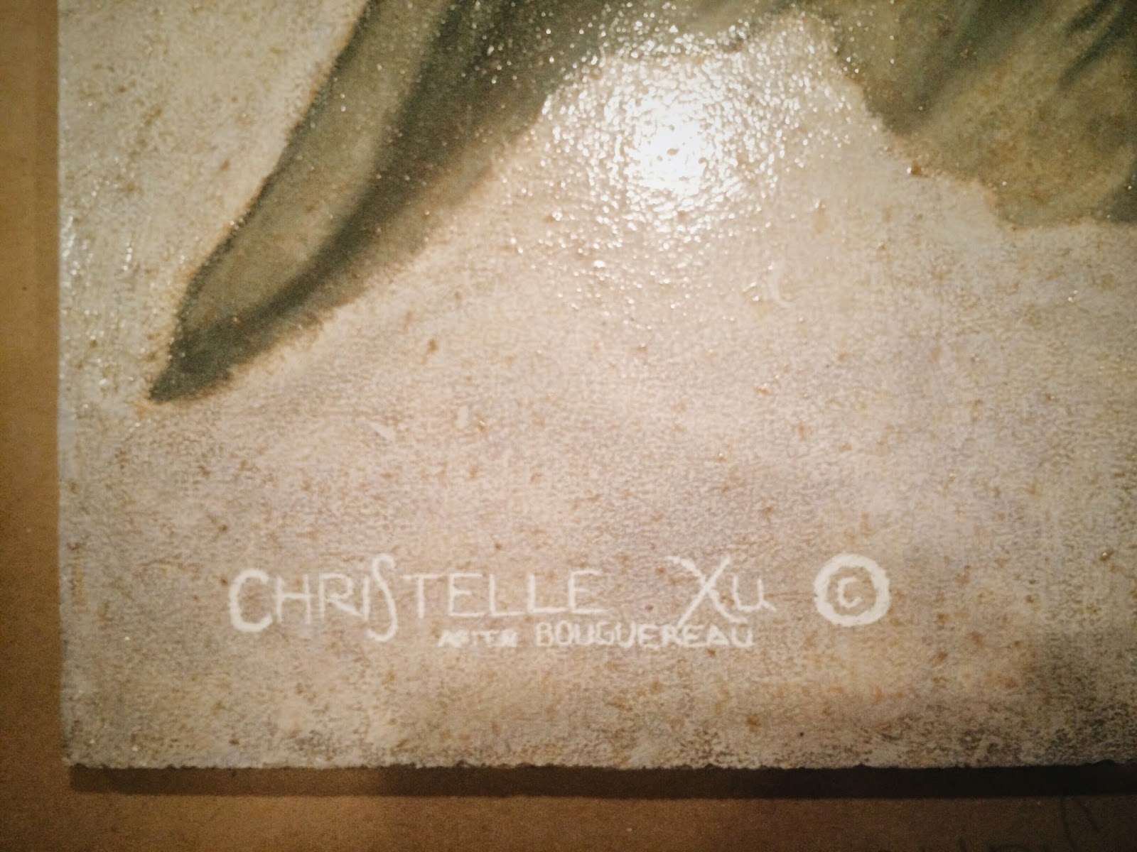
I know the painting I'm working on isn't necessarily one that you'd connect with. Anton Mengs, the original artist was a court painter and for whatever reason, the King wanted a depiction of the Angel Gabriel and Joseph.
I chose to reproduce this painting because it's large and challenging and skillfully done. Mengs uses techniques that I can only hope to master. My job right now is not to create original work for the sake of original work, but to absorb traditional and technical knowledge so I can render whatever message, whatever emotion in a way that will reach and hopefully touch my audience.
I do love working on this piece, though. I've had help from my teacher, Darin, who critiques my painting and shows me how to make it better. He helps me see what I don't see.
It's nearly ready for color, but I still have a few adjustments to make.
Highlights in the hair.
Soften the edges of the drapery of both figures by bringing out the highlights and using three or four values to push back shapes that are in recession.
I need to fix Gabriel's neck, it's flat. His neck just needs a few more values.
It'll take some time, my plan is to finish it this week! As of last night, the verdaccio has taken 97.75 hours.
When Alex first introduced me to Picasso's Guernica, I was far from impressed. Unfazed by my snobbery, he told me how the this gargantuan 11x25 antiwar tapestry would have served as the then Secretary of State Colin Powell's backdrop when he appeared before the UN to gain approval for war in Iraq, had it not been covered up. He told me, "That's the power of an image."
Fast forward three weeks, I'm standing in line waiting to meet Amy Goodman of Democracy Now. Her book, Breaking the Sound Barrier, reads, "A blue curtain was drawn across the tapestry so that the image would not be the backdrop for press statements on the coming war. Immediately, posters and banners of Picasso's Guernica began appearing at the antiwar demonstrations sweeping the globe."
Great artists understand the influence of visual imagery and its power to elicit emotion. Some of these artists are aware of faulty societal conventions and choose to confront it. These are the artists that have the power to incite change. We forget how incredibly privileged we are, but also how much we have left to achieve. Social commentators still exist, activists still exist, and they are motivating positive change for those who don't have a voice.When injustice is overlooked, the artist and the advocate must transcend conventional points of views to bring them to light, sometimes at great personal risk.
I spent President's Day weekend in L.A, visiting museums and eating delicious food. The most significant takeaway from this trip was my evolved relationship with art, particularly with that of modern and contemporary works.
The moment I began contextualizing the works I saw, I began to connect with the art I'd previously written off as arbitrary. Any work can be trivialized to its fundamental components, but when you see a Kirchner painted during World War II, and you realize the significance of the war on the German psyche, the bright color palette juxtaposed with the dark realities portrayed in the piece allows you to step into another human's shoes. For a moment, it's no longer about being German or a painting, but about being a human being, feeling your life ravaged by war.
That's the power of art.
Love \\ Christelle
P.S. The last painting called Burn, Baby, Burn was created by Matta, a surrealist Chilean artist. He greatly admired Picasso's Guernica, and was appalled by the effects of war. LACMA says, "Burn, Baby, Burn work was initially inspired by the horrific attacks of the Vietnam War. In 1965 the Watts riots erupted in Los Angeles when a California Highway Patrol motorcycle officer pulled over a black man on charges of drunk driving. Soon after, thousands of people began protesting the deepest discriminatory practices of the LAPD, reflecting the profound racial divisiveness of the city. Matta saw the Vietnam War and the Watts riots as connected. The cry 'Burn, Baby! Burn!' was coined by the charismatic local radio giant Magnificent Montague, who would shout the phrase every time a piece of soul music got him excited. Listeners in Los Angeles appropriated the cry for the arson that marked the riots."
On Tuesday the New York Times published a piece on a $70 million, 280,00 square foot facility set to host thousands of works of art from the old masters to contemporary artists. The problem?
Only interested buyers will ever see the works inside. (See article here.)
Never mind the emotion art elicits, never mind the power of its message. Let's hope a piece appreciates enough in value within the next fiscal year to make a profit. We've relegated art to commodities trading, pushed aside as another inessential asset effectively cheapening the craft artists have spent their lives developing.
One commenter said, "Conceptual art project: I skip the part about making a painting or a sculpture, and just create a bar code that I submit to this storage facility, noting its availability as an investment. No need to worry about the physical existence of any art object that people actually look at. No need to worry about tastemakers or trends over time; just watch as the demand for this non-object fluctuates unpredictably, just as it will for all the stored objects."
The beauty of art is that it projects the identity of its maker. It preserves the knowledge, the heritage, and the wisdom of the times (or lack thereof). These artists, through their medium, form an interpersonal connection with humans across time. Locking up works of art for an indefinite period of time robs society to benefit a few. But we're not worried about that are we.
I've had a very hard time with the new painting. Of the twenty hours I set aside each week to work on the painting I use about ten. Laziness, apathy has affected the quality of my work.
But why?
I put paint to board for the first time almost a year ago. Diverting from pencil, and sculpting a figure with paint was magic. I had so much to learn, so much to experience, I was so excited. I remember the admiration I had for the classmates that were already painting, developing their craft. One year later I'm grasping at straws to regain that same feeling, that same magic.
Some could argue that the kind of painting I do is restrictive. I beg to differ. Some of the greats of the 20th century, who shaped our notions of contemporary art were classically trained. This form of art allows me expression of the highest quality. So that's not the problem.
Could it be stress? Expectation to perform? Anxiety over an unfinished product? The interference of school?
Perhaps this is what Darin mentioned when he cautioned me against "having to paint." The expectation to produce brought on, not by a gallery, but by myself. It's no longer about getting lost in the craft, but by pushing myself through four hours every day to create something. Not because I want to, but because I have to.
For today, my board will remain untouched. I love this craft, but everyone needs space, even from the thing they think they love most. I've spent about 50 hours on the verdaccio and am about halfway done. It's a mesmerizing piece. And huge. The original artist, Anton Mengs, was hailed as the "next Raphael," and I'm reproducing his work. Pretty cool.
One. Finished the sketch portion of The Dream of St. Joseph. Sketching on a gessoed board feels like manual labor. I was ready to get to painting.
Two. Started painting. Sculpting a figure or object with paint and recreating a masterpiece gives you a serious power trip.
Three. I attended my first figure drawing class last Friday. I was terrible. There was so much talent packed in that tiny back room in the HFAC. I'll try again next week.
Four. I went home for Christmas. Yes I've been in Provo for two weeks, and yes the new year started 18 days ago, but it still feels relevant. The best part about Christmas break and being home was falling back into an old familiar rhythm. Besides being endlessly fed, I made it back to my creative roots. I did a lot of drawing while my dad drank tea and read, something we've done for years.
Five. My dad gave me a tripod head (and a vinyl player #wannabehipster) so we went shooting at Treasure Island. It's an old military base that overlooks the SF skyline. What I'm really proud of, though, is the stop motion I made of me drawing a gem. (See below)
 What piqued my interest most, besides the heart wrenching storyline (my summary does the film no justice by the way), was James' initial lecture. James, an author, is on a book tour where he argues that there is value in the copy of a work in that it leads us to the original, therein certifying the value of the archetypal piece. He says that we associate the word "original" with the authentic, the genuine, the reliable in such a way that it possesses tangible intrinsic value, and that really what matters is what you believe about the piece. If you believe it's an original, that's what counts. Say the original piece was completely destroyed and the copy was all we knew of it. Would that work of art be any less valuable?