Frank Covino is my teacher's teacher and from the moment he stepped into the room, I began scribbling notes. I spent a good portion of this weekend transcribing my notes in what amounted to be about 32 pages. 32 pages! Click here to access the Google Doc.

We began the week with a lecture. Frank talked to us about the history of classical academic painting. He says that if you don't know your history, you won't be aware of what will confront you. He emphasized the importance of the Golden Ratio, particularly with regards to composition.
The Golden Ratio is, as he put it, the ratio from the Grand Designer, 1 part to 1.618. It's everywhere. It's in the heartbeat, it's all over your body, it's in the spiral of a hurricane, and so on.
Heather and I found it in our eyes.
 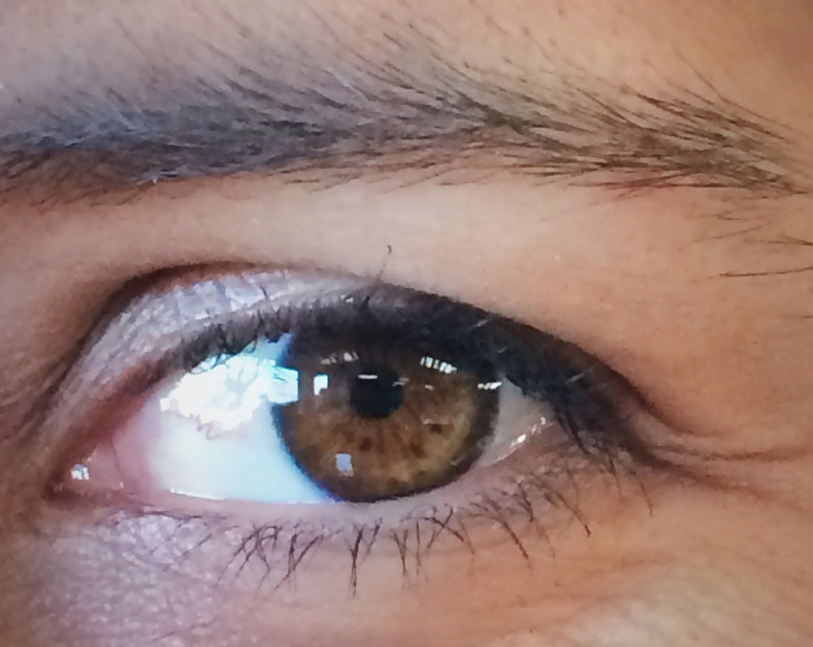 |
| I have three freckles below my eye whose spacing corresponds to the Golden Ratio. Heather has three dots in her eyes whose spacing corresponds to the Golden Ratio. |
Monday was a lot of lecturing. After the general lecture, we went to every station where Frank offered each of us critiques. These critiques were often him pointing out universal rules or ideas that we could apply when thinking through our own paintings. Like the fact that the lower lip protrudes out a little so it has to be rendered a value lighter than the upper lip.
As the youngest in the group I was in charge of the selfies.
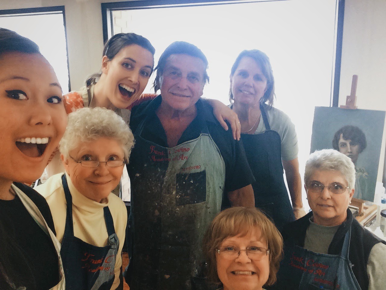 |
| Just missing John. |


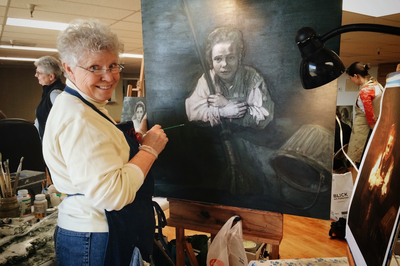
I mentioned Sue above. Here she is working on a Bouguereau.
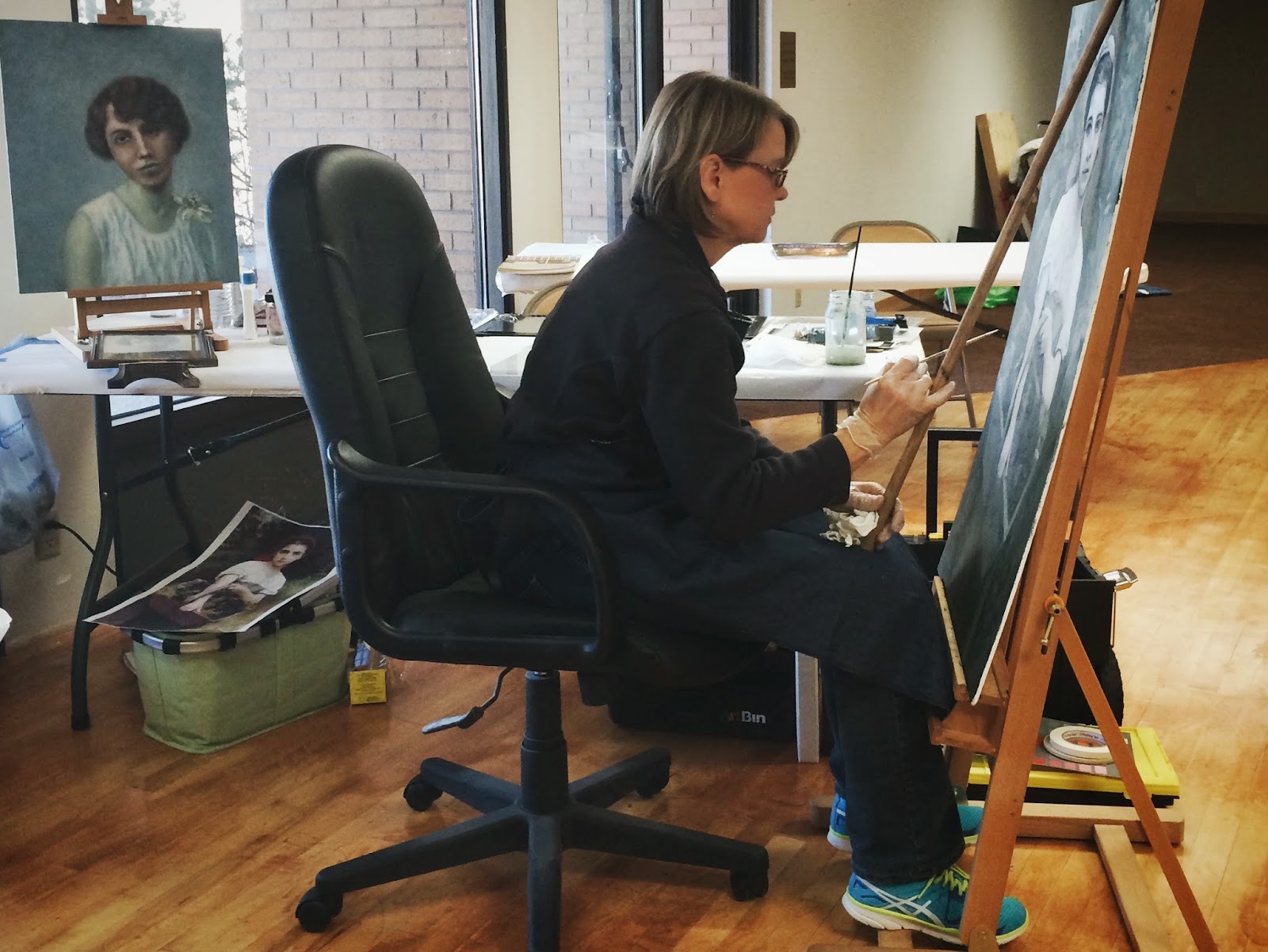 |
| Sue! |
She makes the most incredible caprese salad with homegrown basil.

Sue also had this piece going. Here Frank's highlighting the lower lip. But she doesn't have a color reference so she's basing the flesh off of value, which is cool. She was just starting to add red or blood to her painting. She'll have to logic her way through that. Cheeks, ears, lips, creases of skin typically receive more blood. Flesh depicted without blood will look sallow.
 |
| Sue's grandmother |
I was hoping to get to color this week, but Frank found enough mistakes on my piece to keep me busy. He emphasized to me that it's not enough to be able to see value, particularly on a human figure, you have to know what's causing a change in value. Know your anatomy.
It's a dark, passionate piece, and as a dark, passionate person, he was really excited about my project.
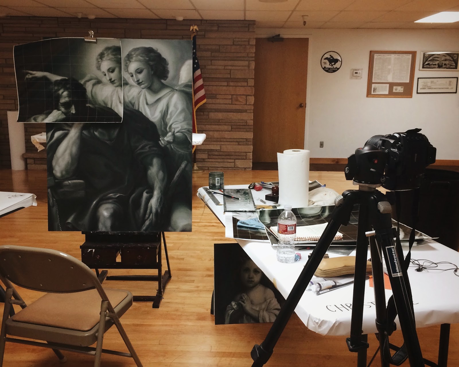 |
| My workstation |

Not getting to color doesn't mean I didn't mix my color palette. We use what's called a controlled palette. Much like how musicians tune their ear to scales, we need to tune our eyes to values. The controlled palette, which is divided into nine values, with nine being the lightest, is a tool to help us reign in those values. Below is me mixing the grey of the flesh palette. I'll mix that grey row with the orange row below to make the flesh row. It's important to compare the flesh row to your reference, no two figures will have the flesh palette. Some people have grayer skin, some have hotter, more orangey skin.
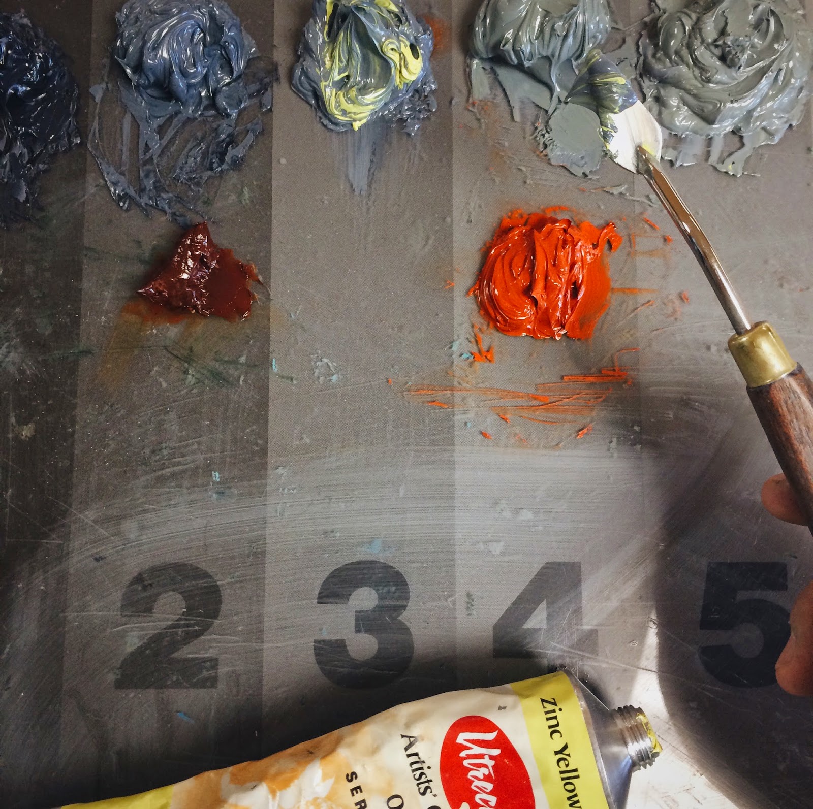 |
| Here I'm adding Zinc Yellow Hue to grey. It's like adding sun to your skin. |
I used the flesh palette to clean up my angels. Apparently you're not supposed to add tinted medium to any values 6 and up which I did. The glaze got stuck in the divots and it you can see how dirty it looks.
 |
| See the dots? :( |
So we sanded down the glossy areas, because you never add oil paint to glossy surfaces, added clear medium to act as glue, then touched up the paint! Note that the sky is darker and more intense at the top and lighter on the bottom. This particular hue of blue made brought out the angels' flesh and made them look more ethereal. Surrounding values will always affect your figures, so be careful.

John was our only other male at the workshop, things have drastically changed since the 15th century. He was the only one doing a landscape so a lot of learning happened at his table.


Like why shadows are blueish, and that the sky gets darker and more intense the higher you go, because fog collects in the valleys, graying and lessening the intensity. Notice the figure placed right at the Golden Mean. Never place a figure or a peak or a horizon in the middle of a painting. Ever.
Most artists just draw what they see, but we're actually creating an illusion of the third dimension on a 2D board! So sometimes you have to fill in the details. Highlights bring an object closer to the viewer, so you'll often see highlights on the nose, or the tips of your lips. If a person is looking at you at a 3/4 view, you're supposed to add a little grey to the back pupil. We do this because we perceive everything through a veil of grey atmosphere. It's not as obvious when you're standing close to somebody, but if you look off in the distance, you'll notice that the mountains that are farther away are grayer, less intense. Just because we don't necessarily see the gray in the receding pupil, doesn't mean we don't include it. This helps us create an illusion of the third dimension.
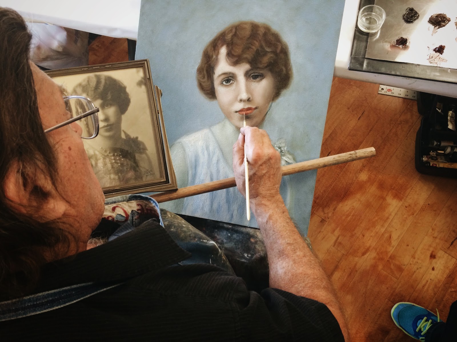
Here Frank is marking up my painting. Sometimes your reference isn't going to give you all the information you need, and surely if your reference is a photograph, you are going to have to take some liberties to render your figure accurately and with good compositional values.
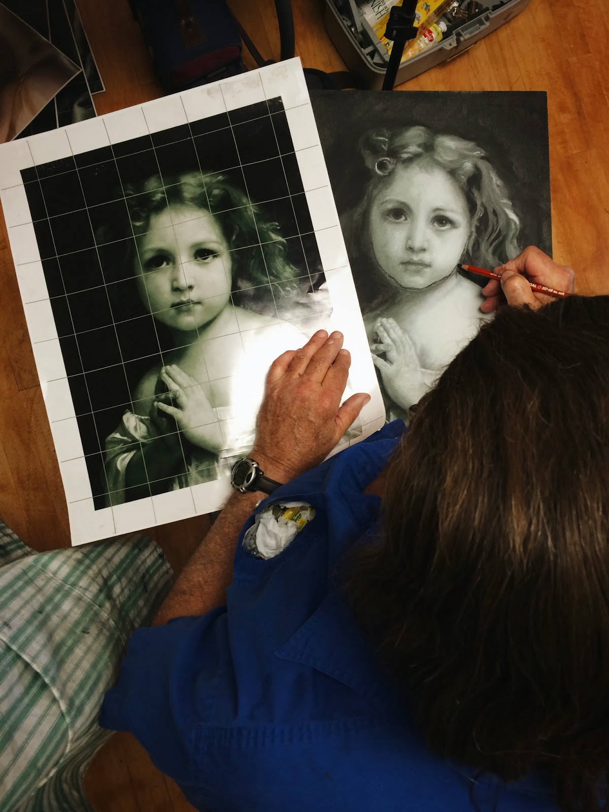 |
| Here he's using a charcoal pencil and an xacto knife to mark my mistakes. |
This is Jerry Lee. She's Vicky's younger sister by 13 months. They've been doing this for decades now and they drive down from Idaho to take this class. From her piece we learned how to build up value. Rembrandt took pains to build up his paint because that texture will catch ambient light. We heard multiple times a day, the lighter the value the thicker the paint. The problem is if you add too much paint, that paint will crack. So we just build it with light coats of gesso. (Light coats, because if you add too much at once, it too will crack. It dries quickly though.) Notice the form/Rembrandt lighting. It wasn't as apparent in the reference, but she knew it was there.
You can also do it with beeswax: 1/3 parts beeswax to 2/3rds paint. Frank told a story about a woman who use this method but accidentally switched the proportions. She hung the painting, a portrait of her husband, over the fireplace and over time, his face began melting off. She said she hardly noticed it at first because she would see the slight droop her husband's painted face reflected in her husbands actual face!
 |
| Jerry Lee working on a Rembrandt. |
 |
| Vicky |
She makes the best trail mix bars. I asked her for the recipe but it's something that she just throws together. Grandmas...

Heather is our coordinator, meaning we wouldn't have a studio or Frank for that matter without her. It's her eye that you see at the beginning of the post. She's musically trained and at one point played us some complex classical pieces on the piano from memory. She's so talented. Anyway, below is a portrait of her mother. Frank helped her shift the eyes so that it looks like she's looking at us. Doing so helps engage the viewer.

She also had him demonstrate the Venetian form of underpainting. You only have 6 hours until the paint dries so you have to work quickly.
The background story is that the Venetians wanted to attract some of Florence's patrons. At the time, Florence was the place to get a portrait. They realized they needed to do something different so they came up with this method.
I still have some work to do on my painting and I'm nearly done, but this is how it looks so far. If you look through my notes you can get a taste for what I've fixed and what I still have to fix.

On Friday before he left, he signed my journal.

It took me some time to get back in touch with reality after it was all over. I am so grateful for this week. I've got work to do.
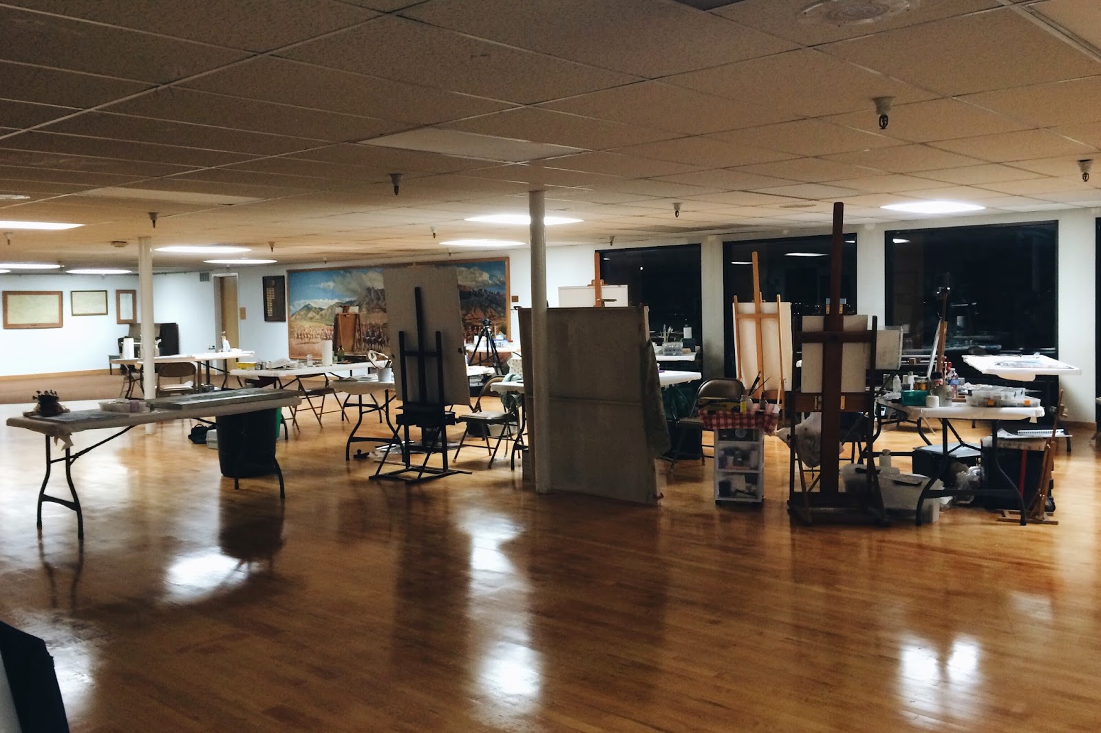 |
| The Studio |
Love // Christelle
